GIS as a Learning Environment for Critical Thinking
Summary
Demonstrates how to use ArcGIS by creating an election map and a map of lead poisoning in the US.
Overview
(Example courteous of Jenni Lund of Wheaton College)
Geographic Information Systems can serve as learning environments that allow users to explore and discover at many levels. Google Earth provides point and click access to the world, taking us on “virtual field trips” through time and space. Satellite imagery goes back a few decades in many parts of the world. Street views provide ground-level perspective. Users’ photos and commentary lets us share the experiences of those who visited in person.
There are accessible social media applications of GIS, like Storymaps. Storymaps can be created nearly automatically by uploading geotagged photos from one’s phone. Easy is nice and Done is beautiful, but if you want your landmark to be in exactly the same spot next year, choose a tool that emphasizes geographical accuracy.
We’ll be working with the entry-level esri application, ArcGIS Online. It lets us visualize spreadsheet data, search for subsets of data points, and do some simple spatial analysis. To prepare for our conversation, I’ve included a case study from a Sociology course I supported several years ago. The experience of discovery is still thrilling, and it’s still a precious opportunity for students to feel a sense of mastery, working with huge data sets.
For those unfamiliar with GIS, I’ve also included an introduction. For those especially interested in GIS as a learning environment, I’ve included two other articles, on critical thinking and quantitative reasoning.
- Preparation
- Create a public account for ArcGIS Online
You are entitled to a 60-day free trial of an account with all the analysis capability of a paid account, but I recommend you wait until you need it to activate that. - Install Google Earth for Desktop on your laptop.
- Download and unzip the GISStarterKit.
Put the RI_LeadPaint folder in a convenient place on your laptop. - Reading (in the starter kit): Chapter_6_Sociology
- Optional reading: What_is_GIS
- Create a public account for ArcGIS Online
- Get ready to make maps!
- Log in to ArcGIS.com with your public account info.
- Create a blank map
Click MyContent
Click Create / Map
Name it 2012 Election and provide the tags USA and election (or whatever)
- Create a bookmark that will come in handy:
Click Bookmarks / Add Bookmark
Name it Continental US
Hit Enter/Return (This is an old-fashioned paradigm, but whenever you type into a box in ArcGIS Online, hit Enter, just in case….)
MAKE AN ELECTION MAP - Load an existing election map from the ArcGIS Online server
- From the menu bar, choose Add / Search for Layers
Find: Maps101 2016
In: ArcGIS Online - Look for the entry called Maps101_Election_Center_2016_feature
Click Add
Click Done Adding Layers - This adds three layers. We’ll work with the last one, number 2, so
Uncheck the first two. Your screen should look something like this:
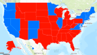
- From the menu bar, choose Add / Search for Layers
- Display the legend by clicking the leftmost icon. It represents opening and closing the legend:
- Display the data table:
- Click the icon to open the table of data:
- Click the Margin of Victory column heading and sort to see the state with the highest margin of victory.
- otice anything strange?
- Investigate the data source
- Click the layer’s ellipsis to open a menu of options.
- Choose Item Details. If you really dig, you can find their data source: https://www.nytimes.com/elections/results/president
- Let’s talk about this!
- Make a copy so the original display is still available to you.
- Uncheck the original so only the copy is displayed
- Click that layer’s ellipsis and Rename it to, e.g., Electoral votes
- Change the map display:
- Click the icon with the 3 shapes to change the display style.
- For 1, chose, e.g., ElecVotes
- For 2, choose the Option for shaded colors
- Choose Symbols and choose a color range
- Click OK and OK and Done.
- Click Save in the menu bar. Make more layers if you like!
MAKE A LEAD PAINT POISONING MAP - Create a blank map. See (1) for the steps.
- Add a data layer called a Shape File:
From the menu bar, choose Add / Add Layer From File
Click Choose file and navigate to HighRisk.zip in the RI_LeadPaint folder
Click Import Layer.
Create a bookmark for convenience. See (1) for the steps. - Save your map.
There is no “auto-save,” so save every 5 minutes or so, to be safe. - "Symbolize" the layer (that is, give it a good visual representation):
- In Step 1, chose, Show location only
- In Step 2, choose Options for Location (Single Symbol).
- Click the default gray dot Symbol and replace it with a yellow square.
- Give it Symbol Size 16
- Click OK and OK and Done.
- Change the basemap to a satellite image:
From the menu bar, choose Basemap, then Imagery. - Zoom to your data layer:
Click that layer’s ellipsis and choose Zoom To.
Spot check a few of the data points, looking for signs of social distress or derelict property. - Add data from the HighRisk spreadsheet of an Excel file:
Use 09RILead.xlsx. This file stores location data as street addresses.
ArcGIS can open .CSV files (comma-separated values), so resave that sheet as a .CSV file.
Import that file into your map. See (10) for the steps.
Click the ellipsis and choose Rename. Name it High Risk Sites
“Symbolize” the data so it is more visible than the default gray dots. See (12) for the steps.
- Add a map note to communicate with your viewers
Look at your map and your data sets for some interesting.
Click Add / Add Map Notes.
Click the rectangle shape. Mark the location of your observation and make a note.
- Add demographic data from the ArcGIS Online server.
Hypothesize some correlation.
Search for an add more layers that might provide evidence for or against your hypothesis.
Add 2012 USA Median Household Income, and any other layers you choose.
Possible search terms are: census, female head of household, etc.
- Share with the group!
ANALYZE AND EXPLORE - Change the level of granularity:
Click on the name of the 2012 Income layer to see the options for granularity of area.
Zoom in and out on the map (with the + and – symbols). Note the granularity changes.
Hint: If a layer suddenly disappears, or is grayed out, you might have zoomed in too far. - Look at the legend:
Zoom in to make block groups active. Click on the name Block Groups to see the legend. - Look at the data table:
Click the icon for the table below the name Block Groups.
Sort by any numeric field.
If your data layer has a funnel icon (not all do) then filter for a subset of data